Skinny laMinx Skinny laMinx
  • Home
  • About
  • Stay in touch
  • 0
Clear
press Enter to search Search results: No products found.

    USA Trip – Type

    2 Oct 2011

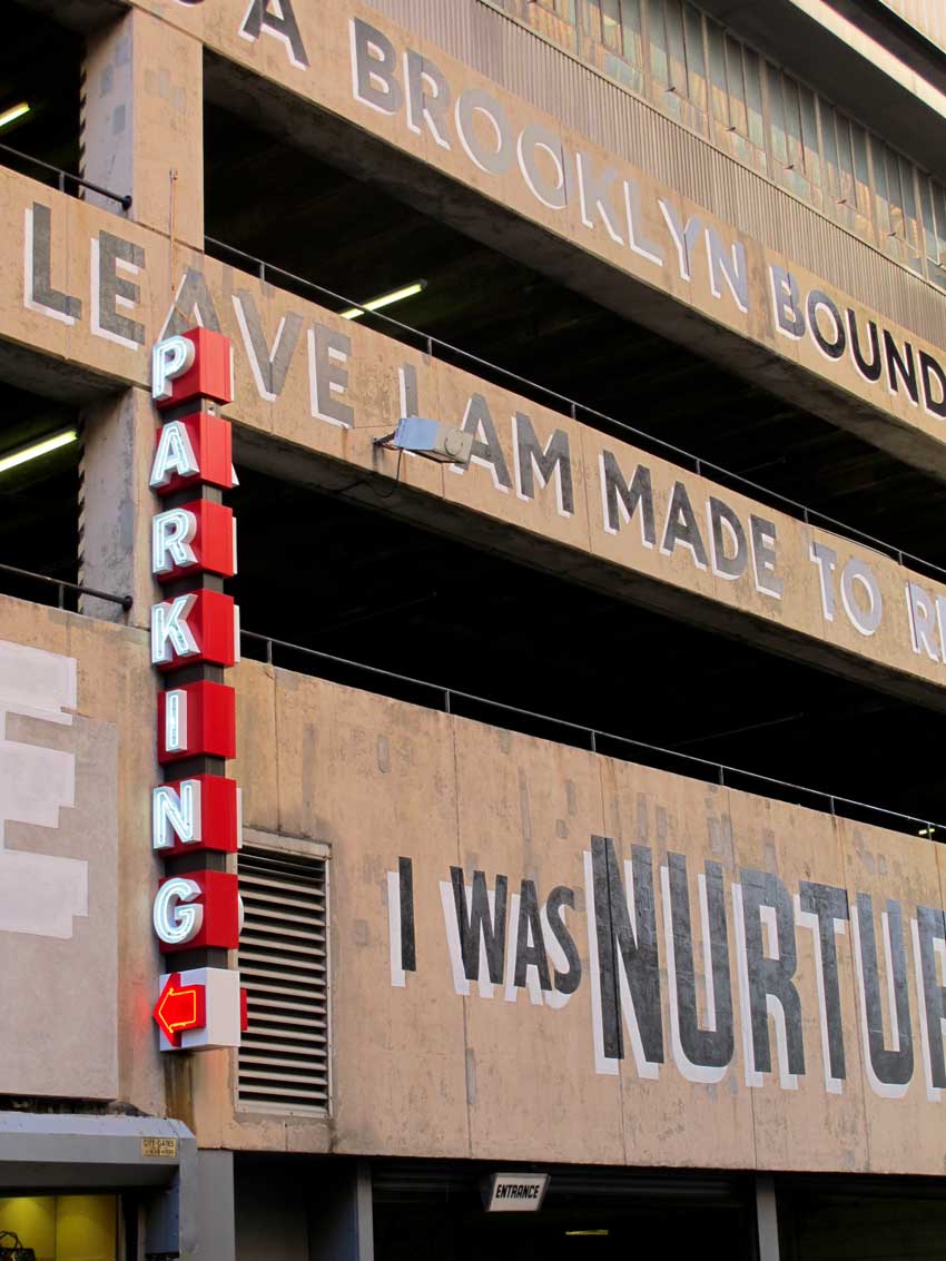
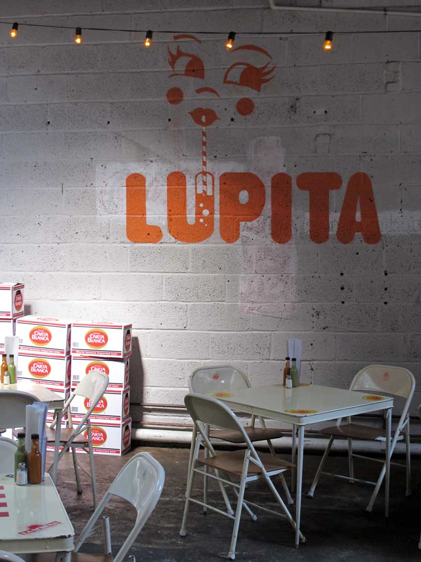
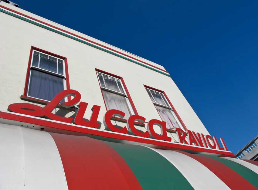
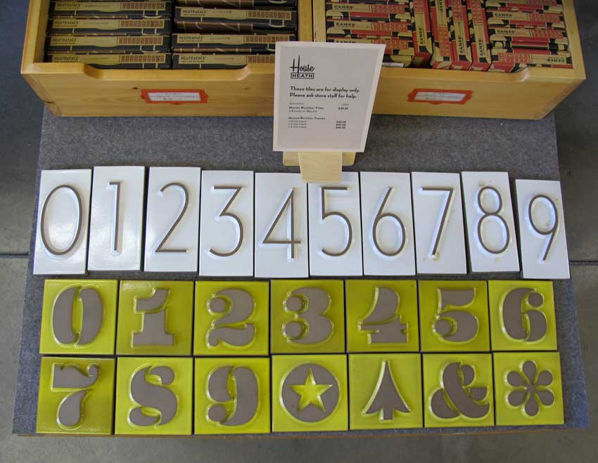
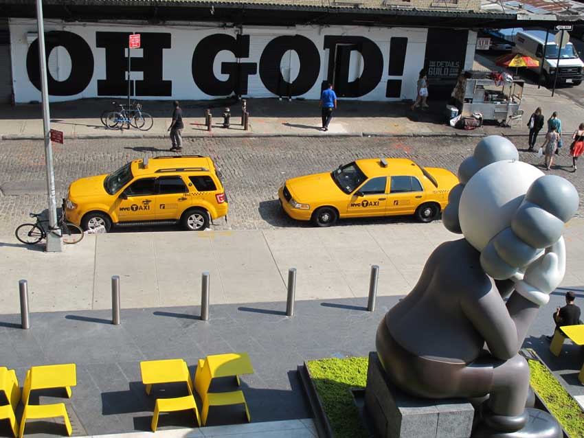
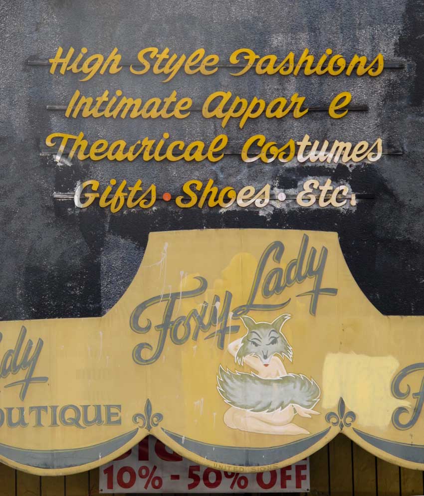
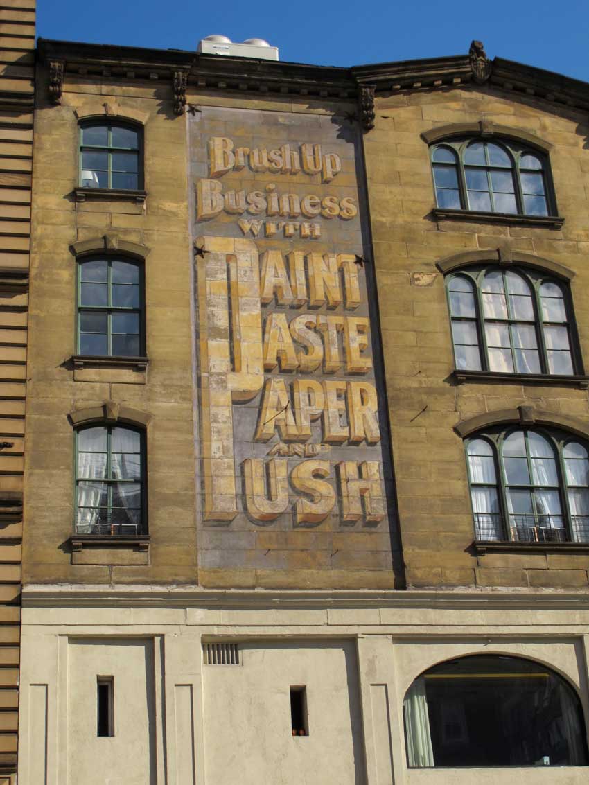
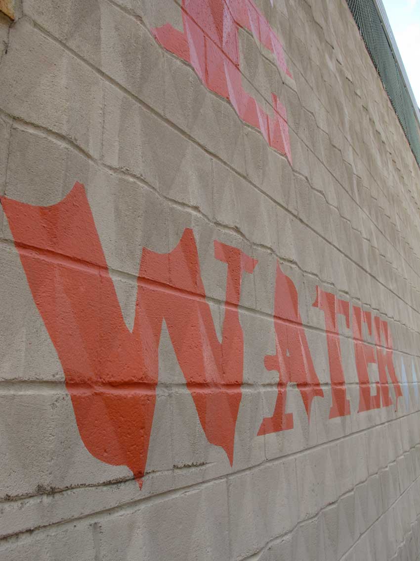
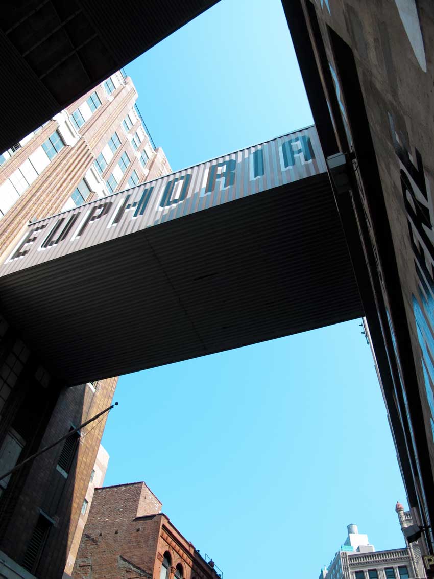
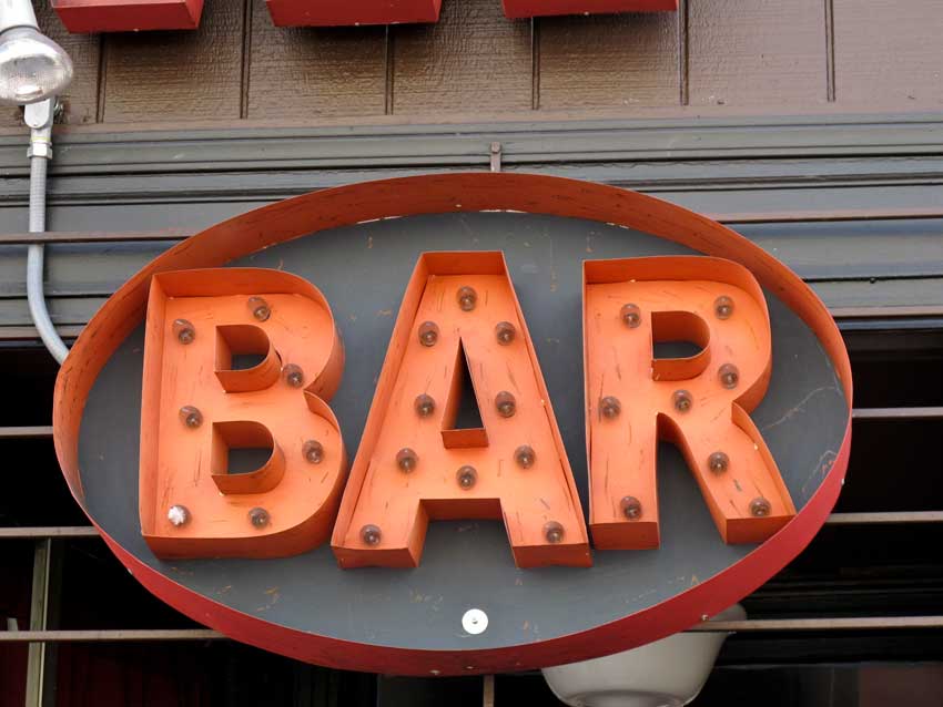
    Everywhere we went, we were overwhelmed by the amazing signage and general array of typography we saw. Many pics consequently snapped:
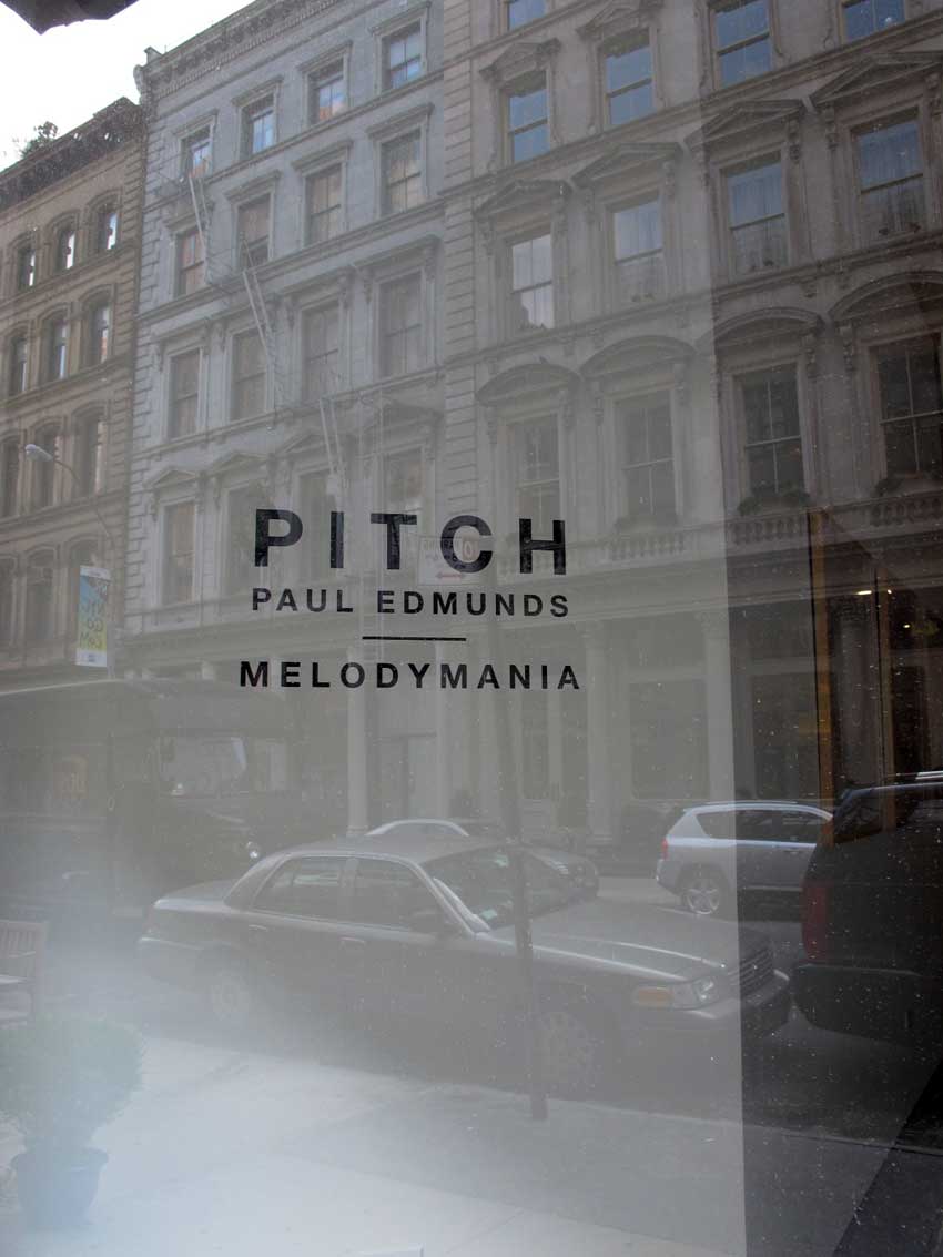
    And while the next pic isn’t particularly exciting typographically speaking, I have to say I got a thrill every time I spotted the window of RH Gallery in Duane St Tribeca, where it tells New Yorkers about Paul’s solo show.
    Posted in Store & Products, In the Press, Travel and tagged heath ceramics, Stockists.
    Share
    ←  NewerUSA Trip – Pattern
    Older  →USA Trip – Place

    Categories

    • Uncategorized
    • In the Studio
    • Design
    • Collaborations
    • Store & Products
    • Inspiration
    • In the Press
    • Travel
    • Friends & Neighbours
    • Video
    • Skinnylaminxenstein
    • Brand
    • Early Work

    Archives

    8 replies to “USA Trip – Type”

    1. Nadia 2 Oct 2011 at 9:04 pm

      Looks & sounds like a rather lovely trip! x

      Reply
    2. arounna 3 Oct 2011 at 7:20 am

      love it all!
      glad you had a good trip

      Reply
    3. louise @Thirtyfive Flowers 3 Oct 2011 at 8:40 am

      Great photos Heather, especially love the ‘Oh God’ made me chuckle out load on a grey UK morning 🙂

      Reply
    4. Janine 5 Oct 2011 at 10:40 am

      Wow wow wow, so good-looking…

      Reply
    5. Chloe Buckland 6 Oct 2011 at 12:11 pm

      Was having a browse on your lovely blog and spotted your Tacombi image!
      Amazing spot was there a week ago sipping on a watermelon juice and just loved the set up, glad to see you had a great trip

      Reply
      • skinnylaminx 6 Oct 2011 at 1:50 pm

        Hey, fellow globetrotter! So pleased you found Tacombi – I think it’s a marvellous spot. Wish I’d had the watermelon juice too, although my hibiscus drink was similarly exotic and refreshing.
        xx

        Reply
    6. Marian 7 Oct 2011 at 5:09 pm

      Hi Heather – Couldn’t agree more with you on the typography – we’re in the US now and I’m loving all the beautiful faded 50s fonts announcing ‘Joe’s Auto Wrecking’ and suchlike… thanks for the wonderful collection of photos!

      Reply
    7. victoria 16 Oct 2011 at 1:14 pm

      I love this post the most. Something about type or font just appeals to me so much, strange that different shapes of letters can be so moving – for me at least.

      Reply

    Leave a Reply Cancel reply

    Your email address will not be published. Required fields are marked *

    This site uses Akismet to reduce spam. Learn how your comment data is processed.

      • Newsletter
      • Blog
      • Instagram
      • Making Friday
      • Terms and Conditions
      • Privacy Policy
    © 2026 Skinny laMinx.
    Login
    • Home
    • About
    • Blog
    • Newsletter
    • Instagram
    • V&A Waterfront Store
    • Stay in touch

    Log in

    Lost your password?

     
    We use cookies to ensure that we give you the best experience on our website. If you continue to use this site we will assume that you give your consent for this.