Skinny laMinx for blokes
The Skinny laMinx store manager Janine keeps telling us how many blokes have been shopping in our store, so to keep the chaps coming in (thank me later, Janine!), we’ve put together a collection of Skinny prints used in interiors that have a somewhat masculine vibe.
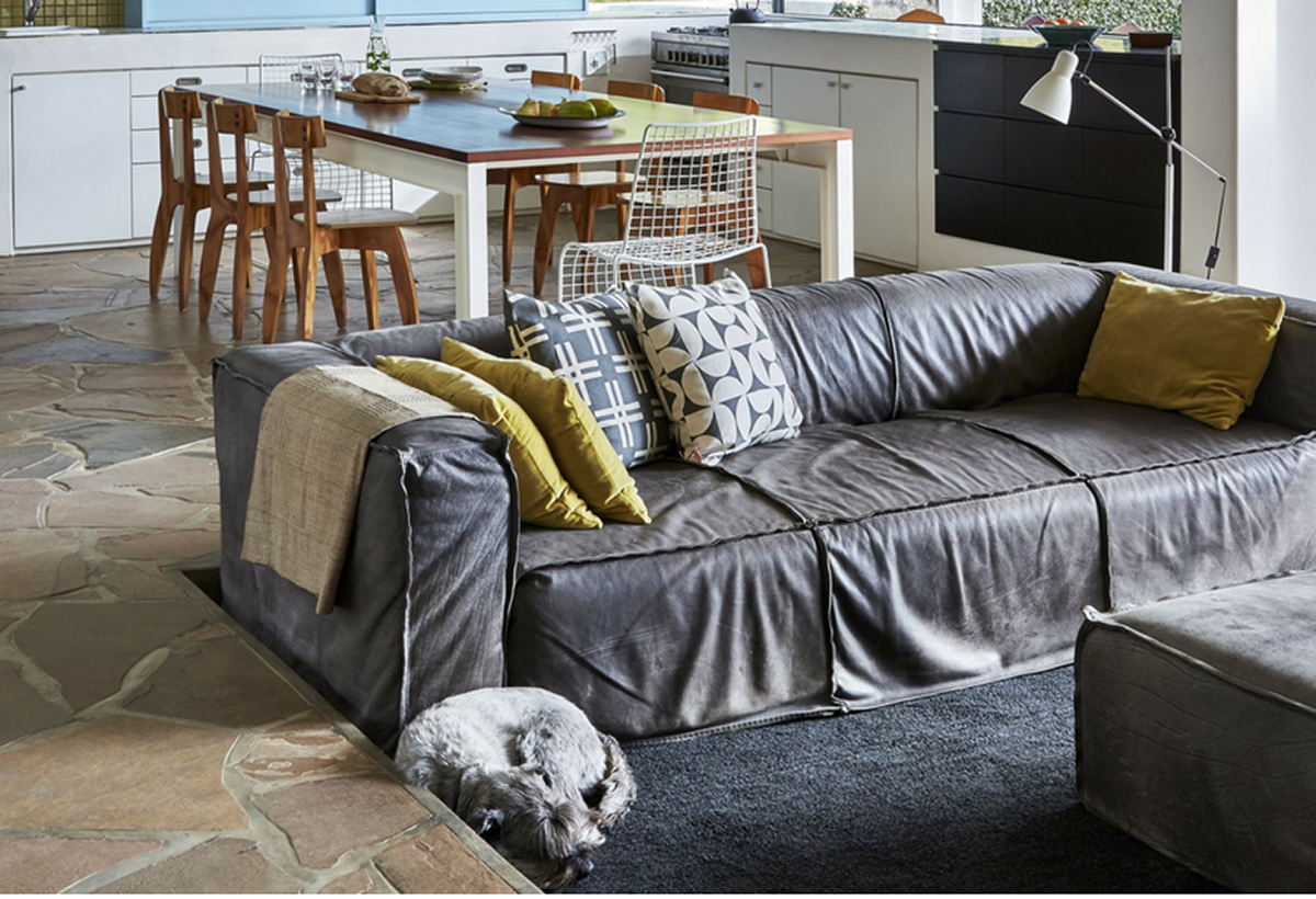
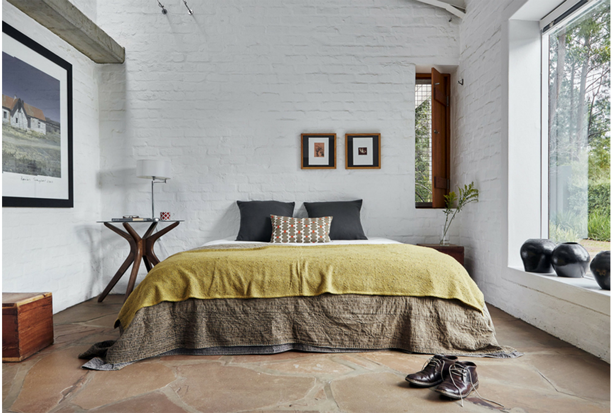
Having said that, though, I’m a girl, and I’d be more than happy to live in architect Martin Smit’s gorgeously simple rooms, featured in Real Estate magazine, wouldn’t you? His doggie is pretty cute, too!

Cushions that I reckon would also fit are (L-R): Simple stripe (in liquorice); Breeze (in concrete); Weft (in concrete); Bowls (in lemon slice); Oddjects (in cocoa); Aperture (in concrete); Brancusi Stripe (in shell); Bowls (in persimmon).
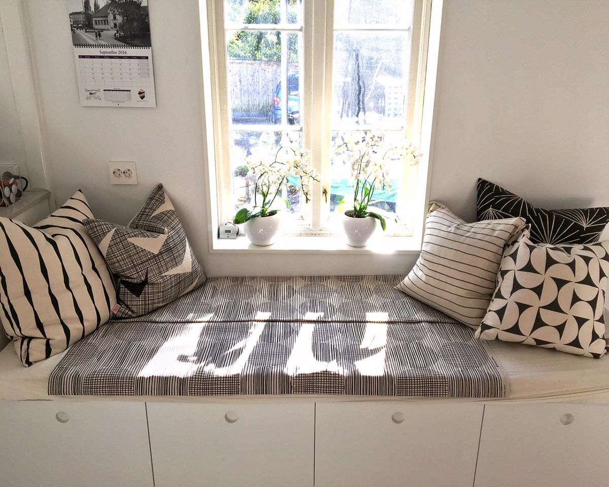
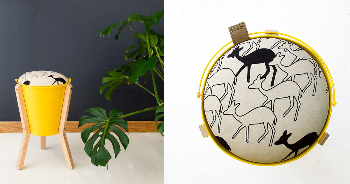
While visiting Cape Town, Sam shopped up a storm, and then put together this look back at home in Norway (above). I really like the way it manages to be highly patterned yet very monochrome and sober, all at once, but I can’t help thinking that a pop of yellow would be fun – perhaps using one of Pedersen + Lennard’s bucket stools with our Duikers print. More here.
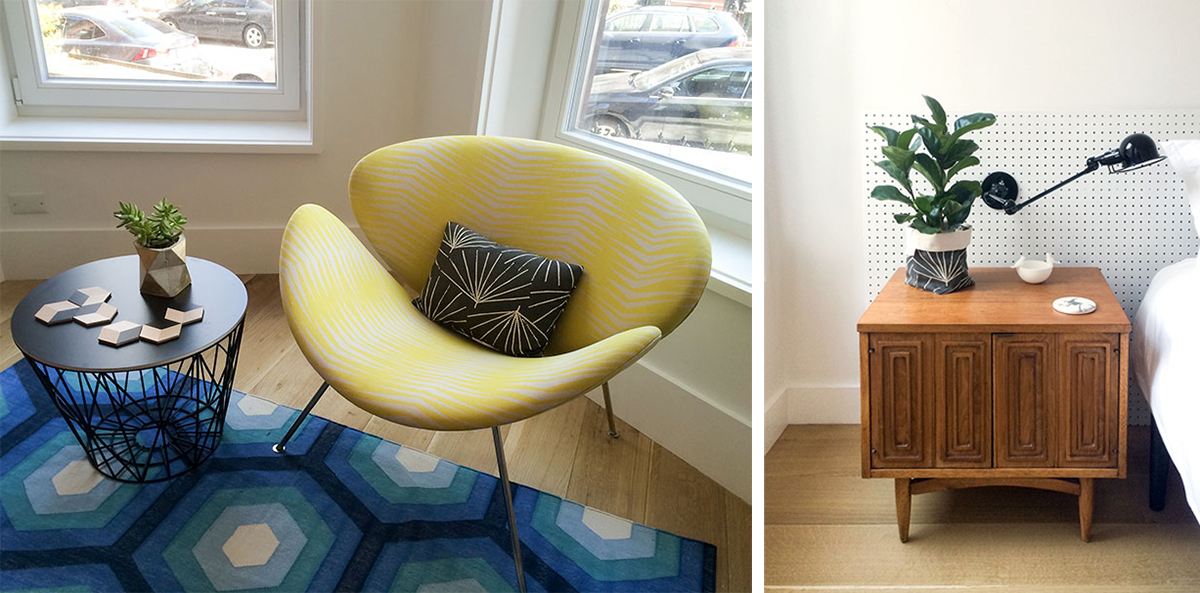
That zingy yellow in our Fronds design is a great match with the black Palmetto print, put together in the Brooklyn home of Andrew and Barbara. See more of their townhouse here.
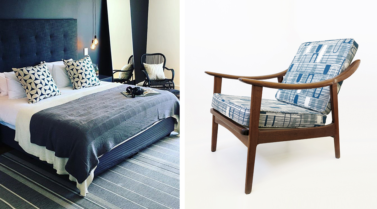
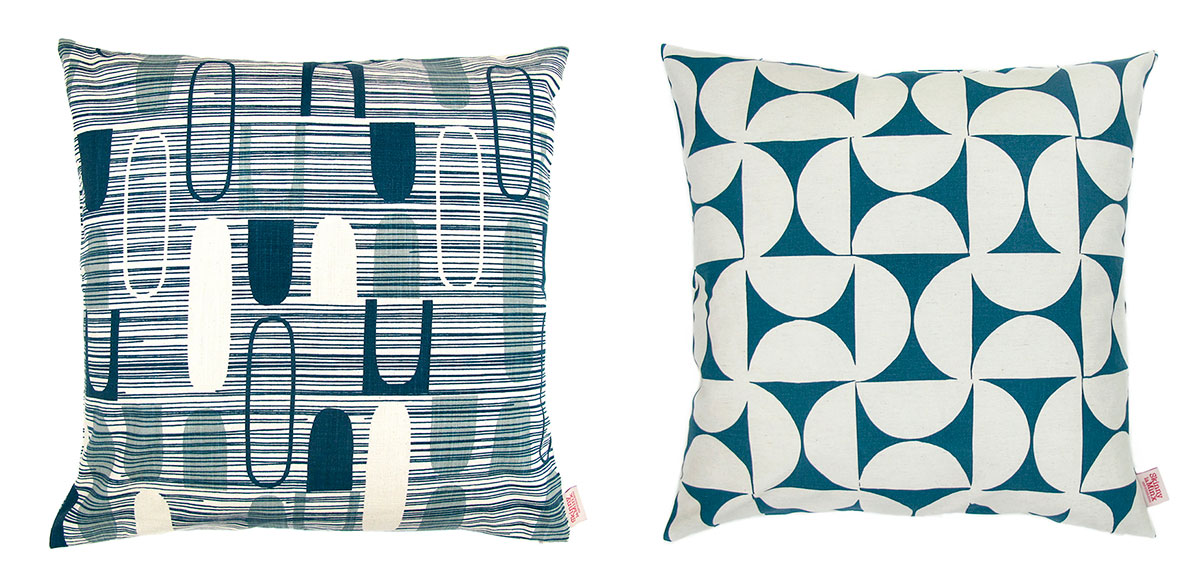
The next pic is a sneak peek of a work in progress by decorator Paula Wishart and we hope to share lots more pics of this gorgeous home soon, but for now, I reckon it’s a great match for our chair in the Dimensional Ovals print, don’t you?
And there you go. Proof that Skinny laMinx is for blokes, as well as for ladies (and for kids too). Nothing for dogs yet, but we have outfits for your plants, so we’re getting there.

