Thinking about colour
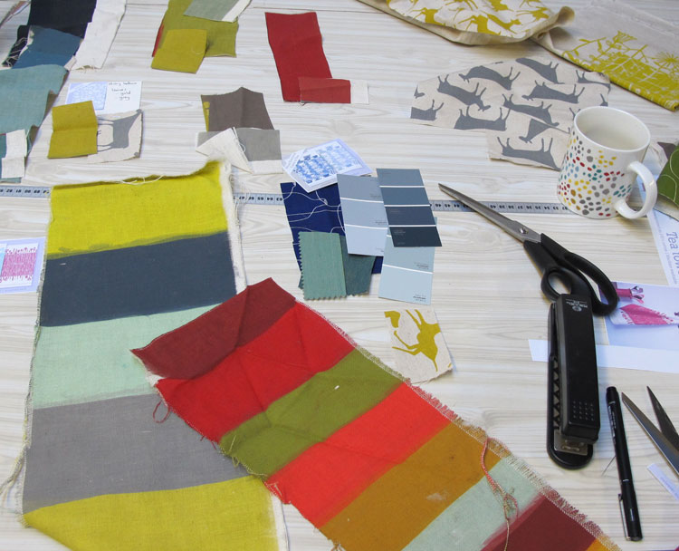
I’ve been choosing colours for a bunch of new tea towels this week (more on those later), and after spending ages scratching through all my stash of fabric, looking for just the right shade of stormy blue, I decided to start keeping a box to store all my little scraps of colour in one place.
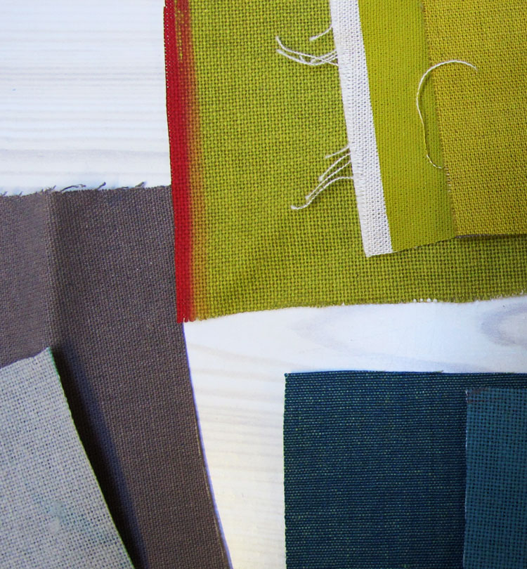
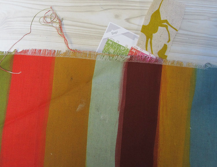
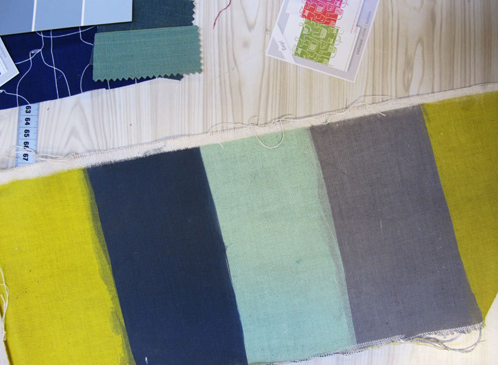
The best things in my colour collection are the colour strikeoffs that my printers produce when I’m getting a whole lot of things printed. I almost chopped them up into discrete colour swatches, but decided to leave them, because I love the way colours that I would never dream of combining end up next to one another.
Sorting through my colour box, I was struck again by how incredibly important surface is to the way I perceive colour. When I try to choose a colour for textile printing from a flat paper surface like a Pantone book or paint sample card, it only feels like a starting point – a vague stab in the right direction. However, if I have a scrap of woven fabric in the right tone, I have no doubt that it’s exactly the colour that I want.
I think this is because colour on fabric is so much more than just a formula of pigment parts. It feels a bit like the relationship between a note of music and the instrument it’s played on – the thing that gives a note timbre. So, while scientifically speaking, an ‘A’ may have a very specific wave length, when that note is played on a range of instruments – a piano, a violin, a bassoon or a kazoo – it’s really not the same thing at all. In a similar way, one particular blue reproduced on paper, barkcloth, silk and nylon cannot be perceived as exactly the same blue.
And, of course, there’s lots more to this ‘timbre’ relationship of pigment and surface: some colours and textures have historical/era-specific associations, and of course, every person has their own memory associations with textures and colours too.
Now, if you’ll excuse me, I have to go and look for just the right shade of 50’s dusty pink. I saw it on a vase somewhere once…


Asiye
oh i just feel renewed, after diving into a sensual feast of colour! really enjoyed reading about and looking at colour, wish i could feel the fabric too… enjoy your delight! i am off to find beautiful colours outside
Lynne
I love this post, Heather! So true… X
skinnylaminx
So nice to hear from you! Hope you’re enjoying being a mum. Must come an meet the little guy soon. xx
Danya
Lovely colour combinations! In the second photo, I particularly see what you’re talking about.
Juddie
Oh! So lovely! These colours make my heart sing!
Anton Marshall
I have to say that’s a brand new way of looking at it for me… though I can totally relate to the musical reference. Kudos.
Erin @ Slipcover Your Life
LOVING all of these colors! Want to surround myself in all those swatches (doesn’t it just get your creative juices going?)