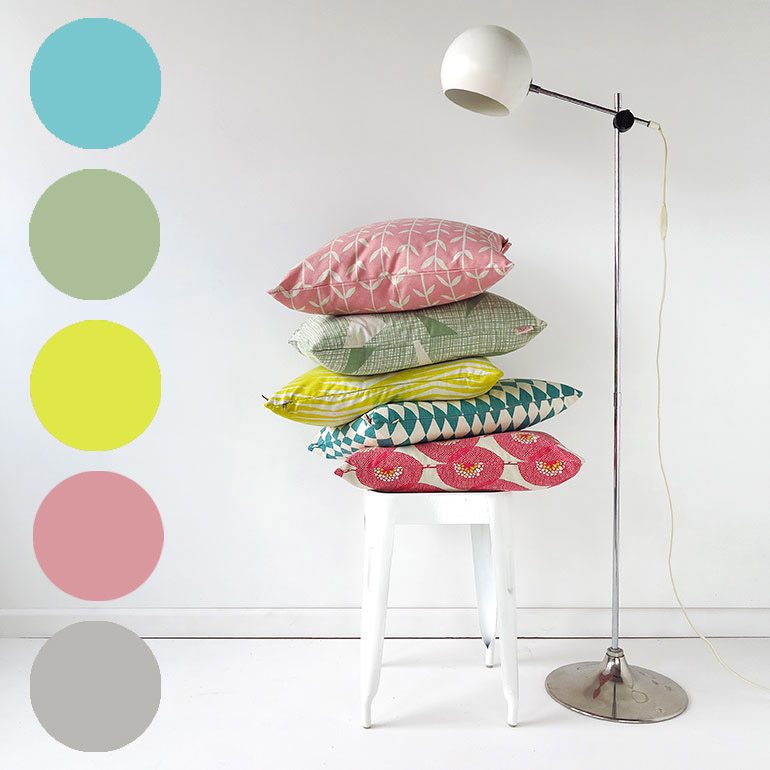
Ahead of the pastel pack
I just heard that Pantone has released its colour palettes for 2016, including one they call Ephemera, featuring “delicate shades of wan blue, pale peach and tender yellow”.

Well, ahem, what have I been saying for about 3 years, with our Acid Pastel and Sweet & Sharp Lookbook images? Way ahead of ya, Pantone!
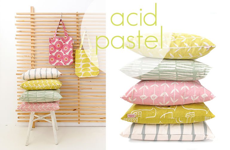
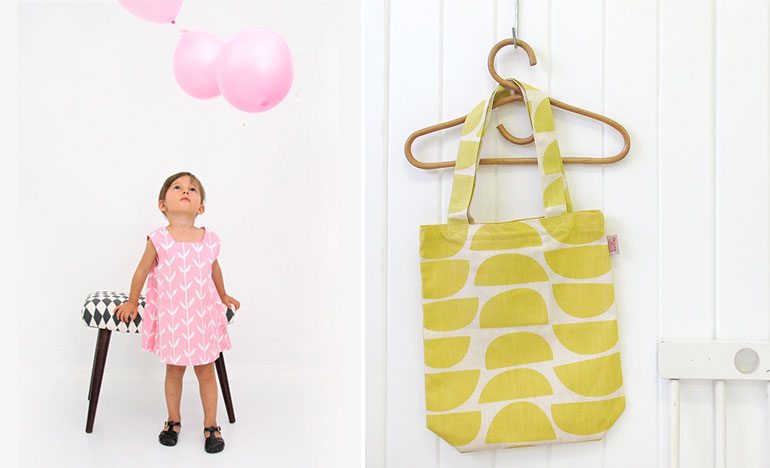
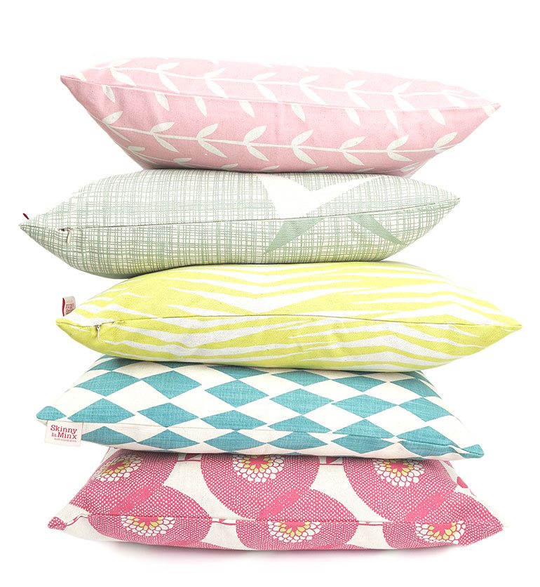
PS: If you’re loving this palette, you’ll swoon at these images from UK-based interior stylist, Charlotte Love.

Rose McClement
Hi there – I always wonder just how it is that Pantone come up with their colour of the year each year. I know that there are many factors that they take into account, but how on earth they got to Marsala this year – well I am going to have to Google it I guess. These ‘ Acid Pastels’ are interesting. Just the other day i was completing a questionnaire for a blog interview. One question was about my personal colour preference – and – I just could not connect with that at all. Maybe working with so much colour has got me all ‘ colour-ed out’. But soft soothing still is somewhere within my psyche.
Faith Busiek
You are a tastemaker- no doubt about it! Perusing style blogs and real estate ads and many things in between, I have seen things that “look like Skinny” many times! Sunlight and pale flowers, afternoon skies- these things come through you into our world, and we very much appreciate your passion!
skinnylaminx
Ah, you’re very kind to say so. I very much appreciate your taking the time to leave a comment!
x Heather
skinnylaminx
I’m with you on this odd Marsala selection. Maybe a very influential paint company had warehouses of that colour they needed to move? More interesting is the way that the magazines etc obey the forecast on their pages. That’s not a prediction – that’s an edict!
I’m also not so good on colour preferences. I generally like mixes of colours, but to settle on just one mix? Not really possible.
x