Colour: Inspiration for Brise Soleil
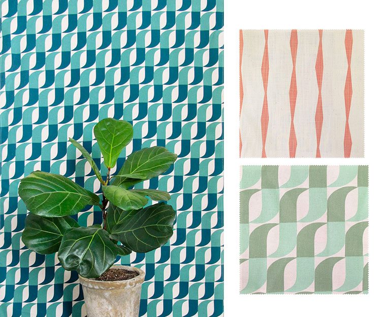
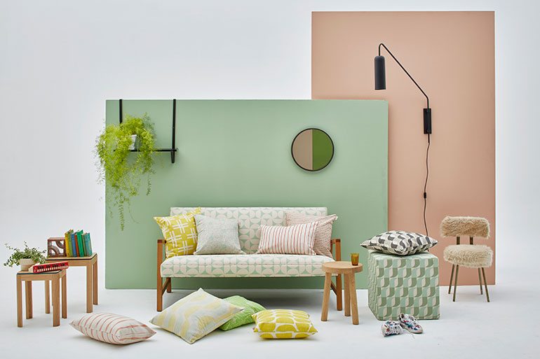
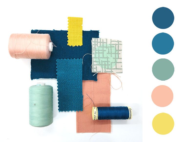
Post-launch, it’s always great to look back at what inspired a collection, and of course you know that the patterns designed for the BRISE SOLEIL collection were inspired by breezebrick midcentury screens, but I thought you might like to see my inspiration behind this colour palette, which you’ll see used throughout our 2016 Lookbook.
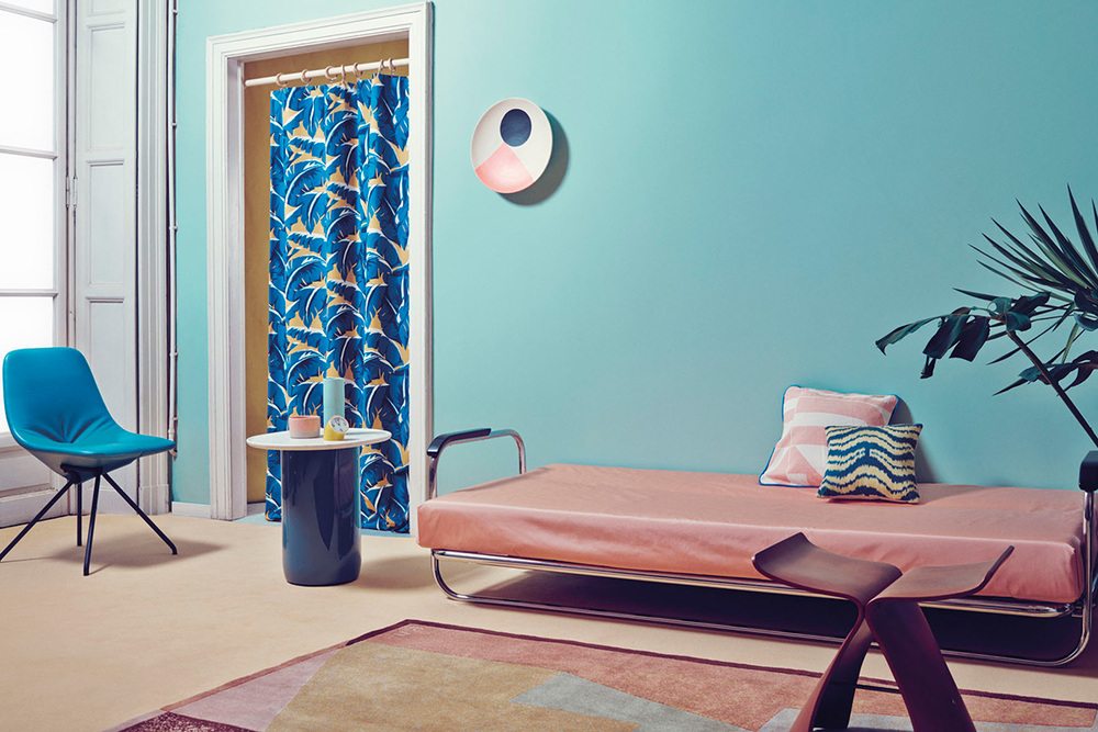
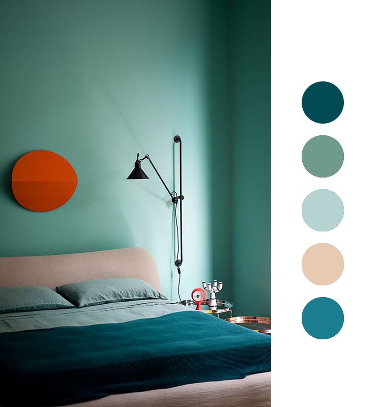
The strange, but insanely sophisticated colours used by two Milanese studios – Studio Pepe and Dimore Studio – provided me with much colour inspiration. Aren’t those rich petrol blues, popped with burned orange shades, minty greens and orangey pinks are utterly delicious?
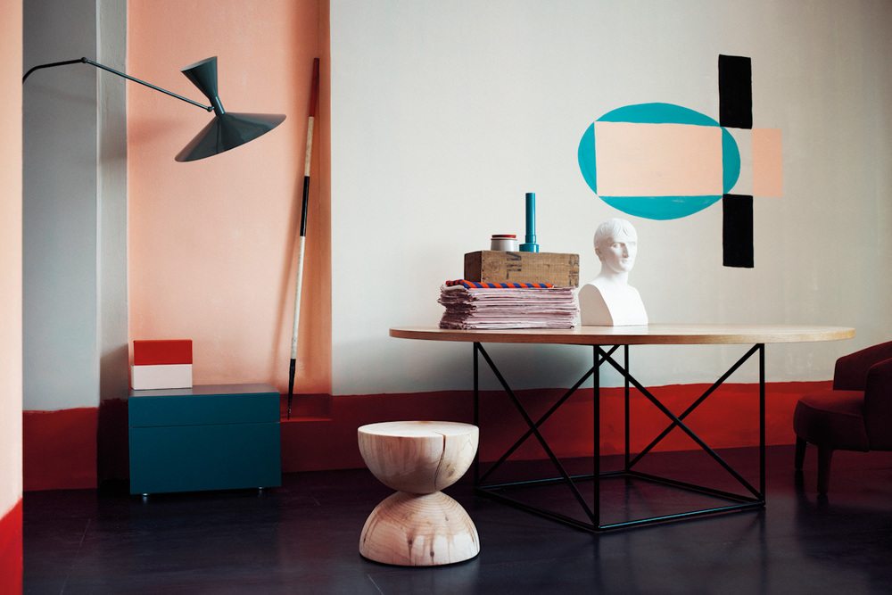
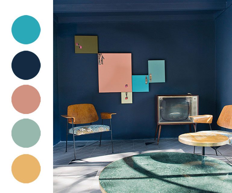
Dimore Studio – Hotel Casa Fayette. Photo: Undine Prohl
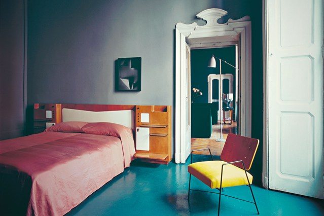
Dimore Studio – Milano Brera. Photo: Andrea Ferrari
And this is how it all panned out for us, with those dirty blues and greens, popped with a reissue of the Brancusi Stripe in shell, as well as a sharp sunray yellow, in the Weft design.
