I hate purple… or do I?
Through Darkness Into Light
Skinny laMinx is one of Heath Ceramics‘ partners in craft (lucky us!) which means we always see their seasonal palette quite a long time before products are launched.
I’m usually thrilled by their amazing colour combinations, but when I saw the Winter seasonal palette earlier this year, my reaction was. “PURPLE??”
The thing is, a vague but deeply-felt childhood memory of synthetic duvet covers and the smell of a home perm resulted in an irrational but deep dislike to this colour and its associated tones, and my heart sank at the thought of producing our patterns in purple.
But I worked on my prejudice, noting pleasing plummy shades on flowers, sunsets and the lavendar tones in shadows…. and of course, the beautiful writing from Heath about the Winter seasonal palette helped a lot too.
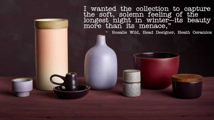
Here’s what Rosalie Wild, Heath Ceramics’ head designer said about the palette:
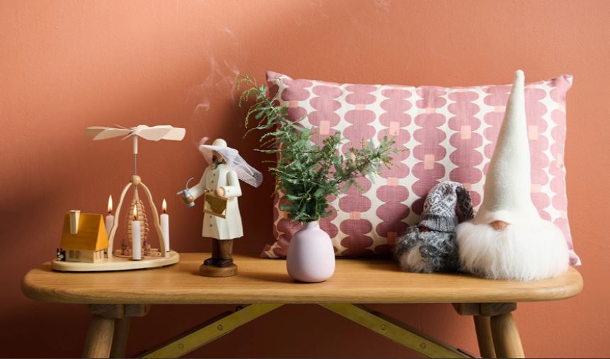
The thing is, any colour is changed by the colours alongside. And the purple tones alongside warm berry hues chosen by Heath Ceramics result in a rich cosy palette that speaks of deep flavours, and slow moments. And when I see our tea towels, runners, cushions and more set in this context, I’m sold!

Click through to see the full Heath Ceramics 2021 Winter Seasonal collection.


ROXANNE SPEARS
I laughed out loud when I saw your newsletter subject pop into my emails a moment ago.
I had to stop working just to read it, as I too have an irrational dislike of purple.
The Heath ceramics designs are stunning – especially the nightfall coloured pieces – yikes I think I might have gone to the dark side!
Your shard designs in sand are my favourites of your work – you’ve managed to stay in the light… hahaha
skinnylaminx
Hi Roxy
So glad I got you to laugh! I’ve had a LOT of fellow-feeling around the purple aversion. There must be more to it than the home perm association. Maybe it’s all just a bit too… much?
Ja, the Heath collection is beautiful. They’re total range geniuses and I feel super lucky to have my brand associated with theirs.
Look out for the Shard being launched next year, in tea towel and cushion format. It’s a beaut, and it’s got a great story.
xox
Heather
RebaGG
I just saw Pantone color of the year is Very Peri, also purple! You are prescient for 2022.
skinnylaminx
I’ve just seen that today! Wow, I’m finally bang on trend… completely by mistake 🙂
xx Heather